Product Page Redesign
Atalyé
Atalyé, a cutting-edge fashion and tech brand, is leading the way in sustainable, made-to-measure fashion for women. With the use of 3D body scanning and their own automatic pattern generating software, Atalyé creates bespoke garments in a matter of days. As the brand's customer base and order volume grew over the past year, it became clear that improvements needed to be made to the customer flow and internal processes. As a result of user feedback and internal research, I took on the responsibility of redesigning the product page of the online store, while automating the flow of data between the online store and Atalyé's automatic pattern making software.
Year
2022
Contribution
User Research UX Strategy User / Data Flow Usability Testing A/B Testing
Team
Maud de Boer — UX/UI Design Chander Rajput — Frontend Firdos Aliev — Backend
Challenge
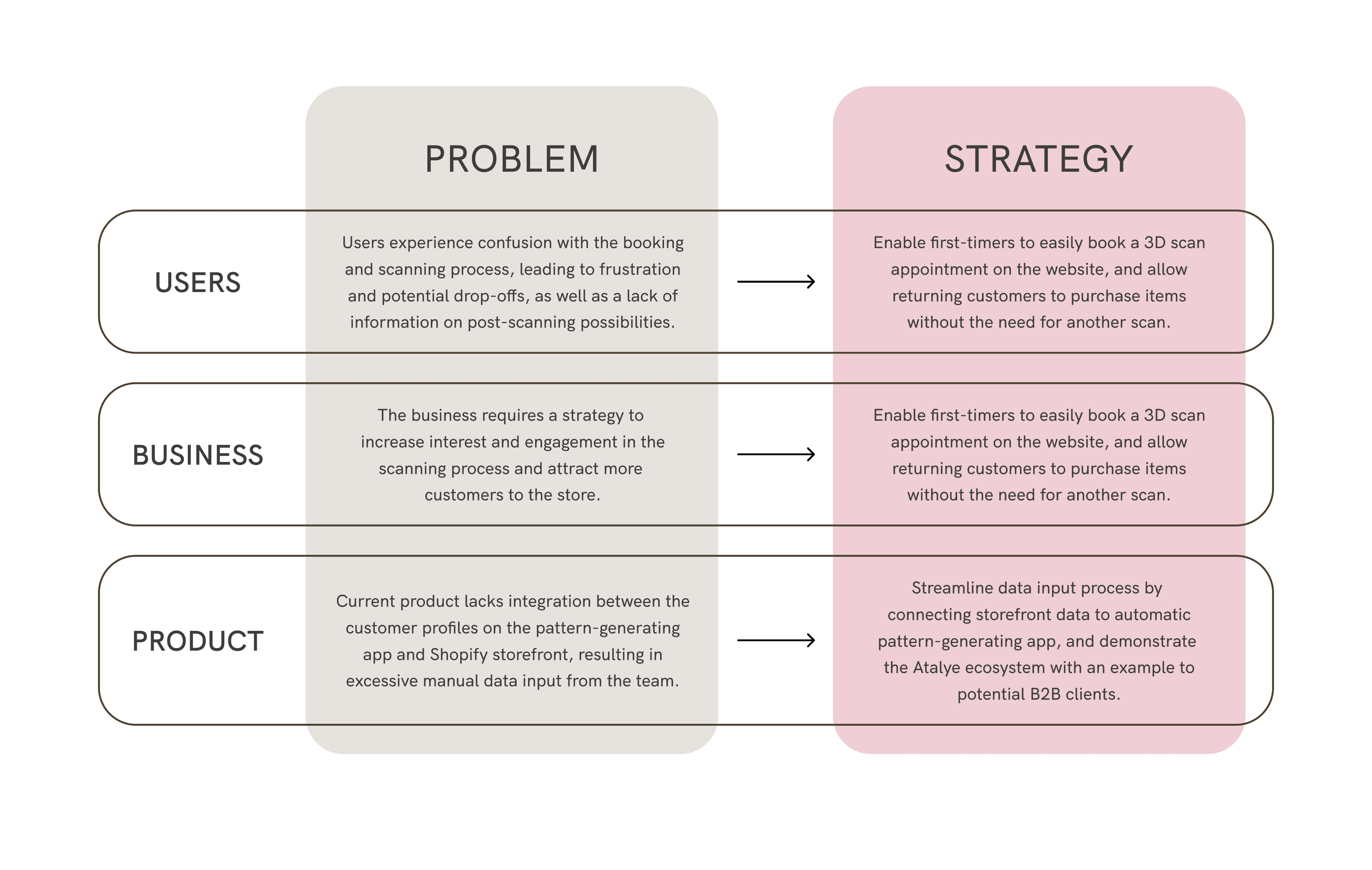
To thoroughly understand the problems, I divided the research phase into two stages: a stakeholder workshop to determine business goals, followed by customer interviews for insights into pain points and website feedback. After writing down the problem statements, I created UX strategies for each level of the business (users, business and product) by taking into account internal and external points to determine the goals and scope of the project.
User Data Flow
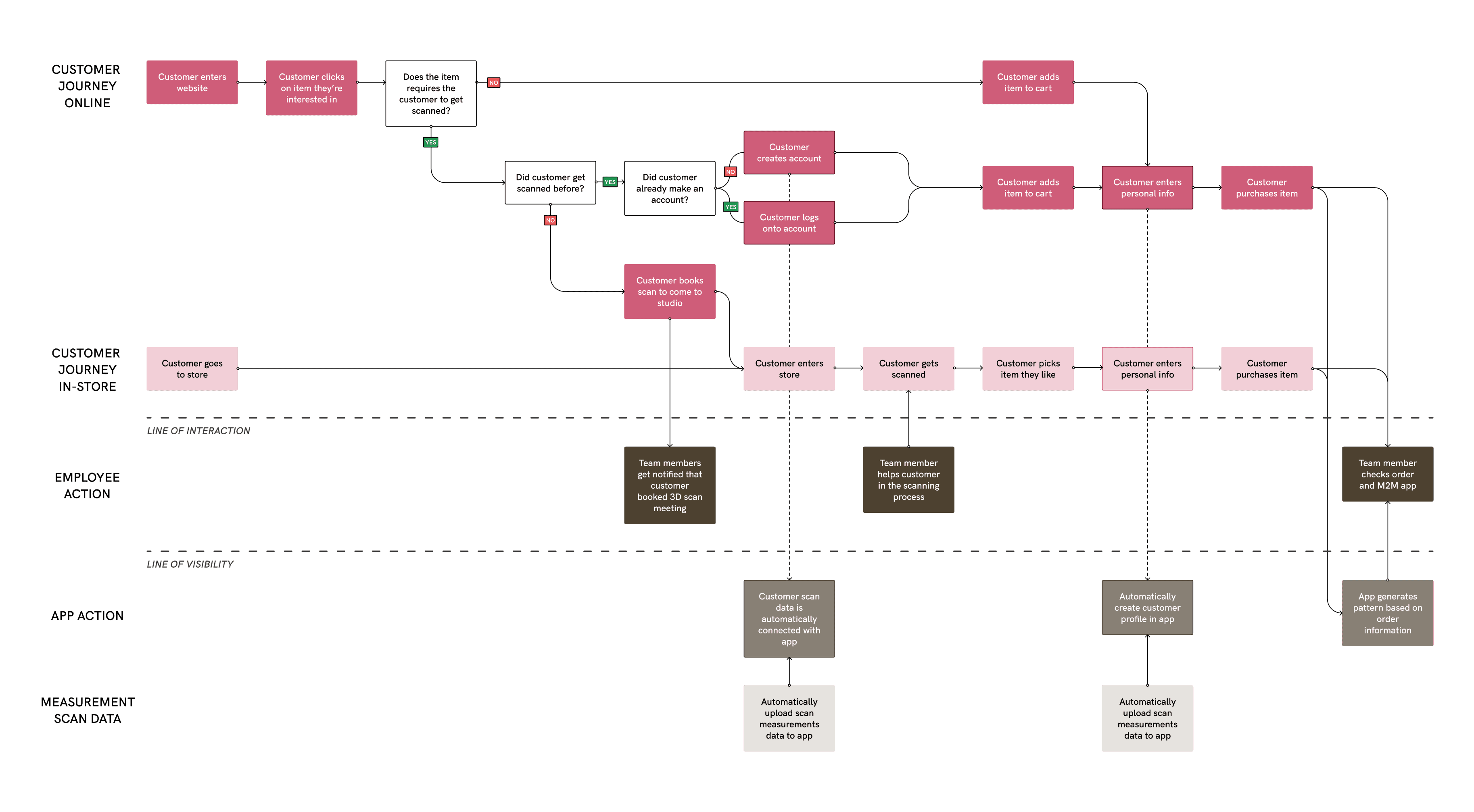
To align product and user goals, I created a user data flow to track customer actions and their impact on the business’ backend. By mapping out various scenarios, I facilitated the development of an API that links the storefront to the app. The user flow guided me in determining the necessary screens to create.
Visual Feedback
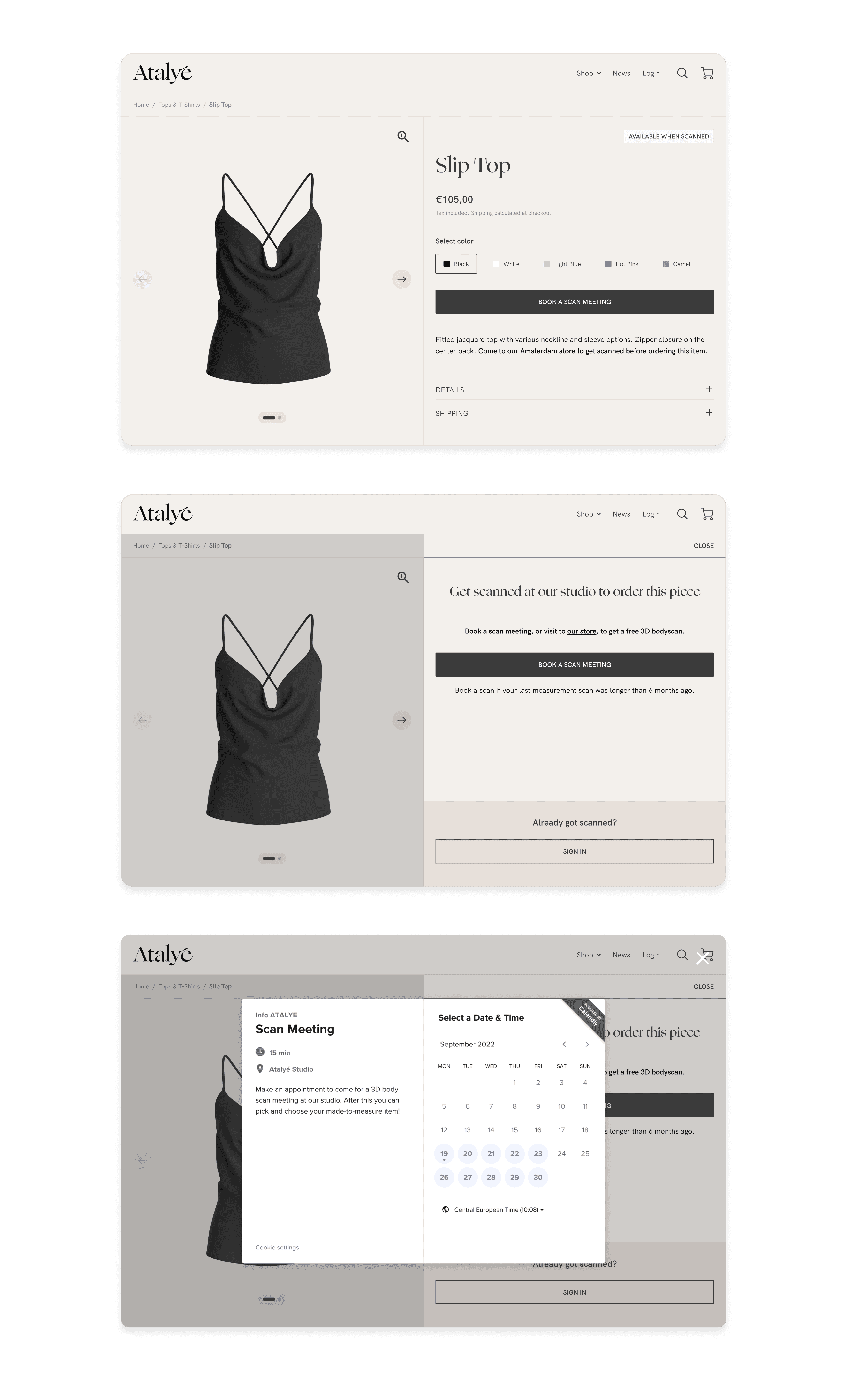
After conducting usability testing and collaborating with the front-end developer, I discovered that Shopify's limitations affected my previous designs. To address this, I made additional design iterations that incorporated visual feedback points aligned with the theme's styling, resulting in the most effective final design.
Calendly
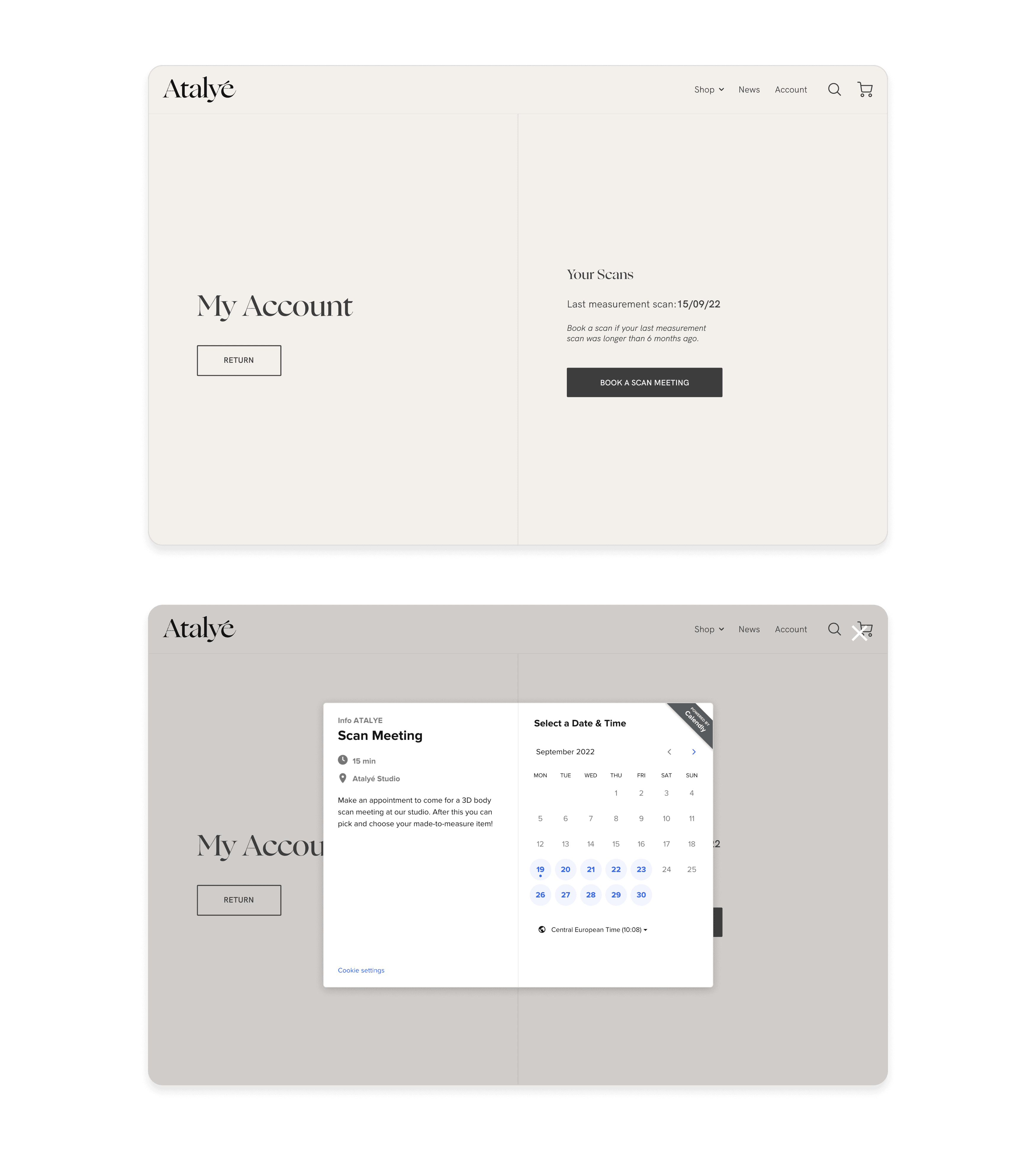
Due to budget and scope constraints, I selected the free app Calendly for customers to book their scans, as it offered seamless integration and communication options. Now, the team receives automatic notifications whenever a customer requests a scan. I added the Calendly widget to both the product page and customer profile.
Product Tags
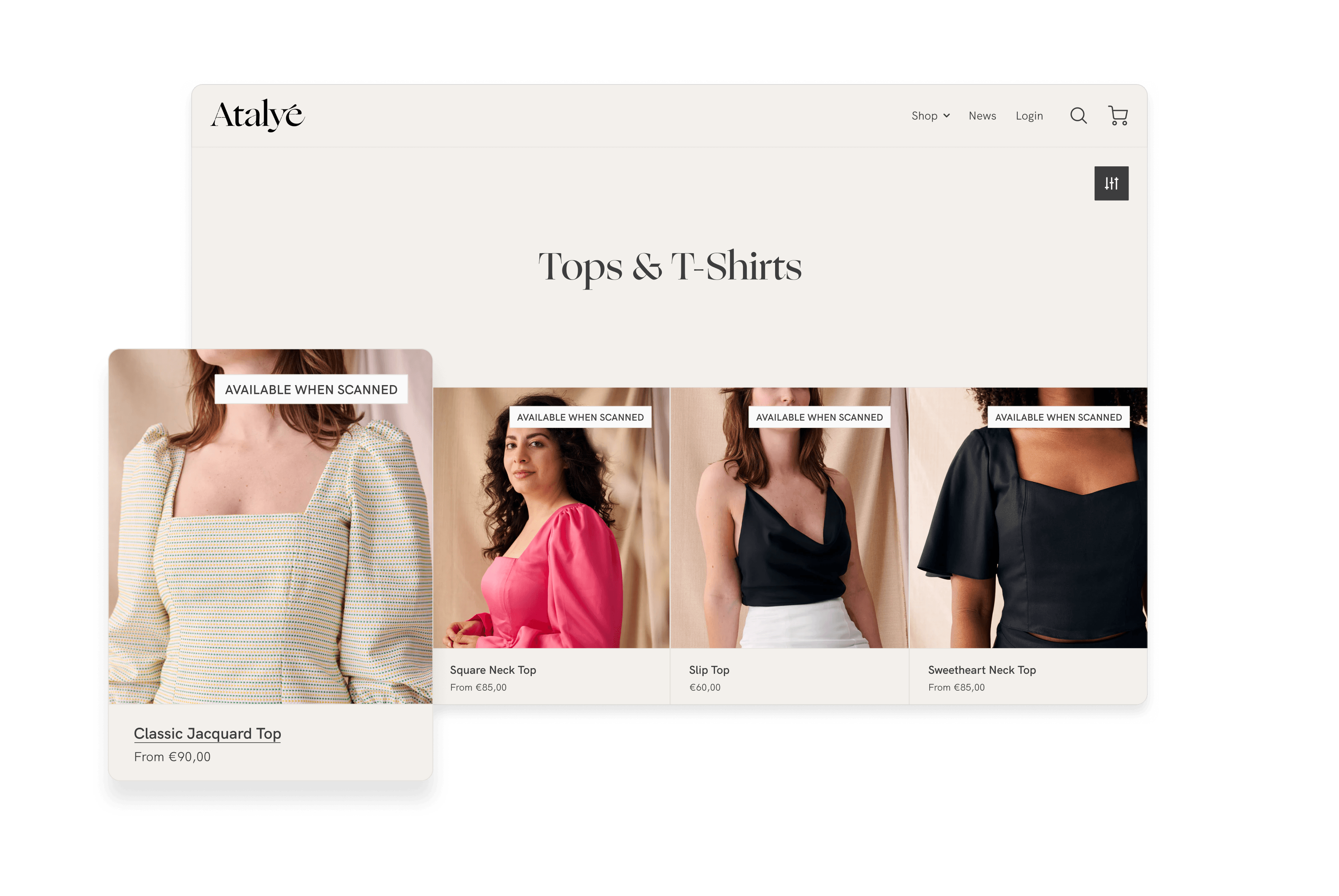
To distinguish between products that require in-store scanning and those that do not, I created product tags displayed on collection pages. These tags are enabled internally via tags specific to each product. Products that do not require scanning have a different product template. As a result, customers can easily identify which products require scanning.
Results
The redesign resulted in an improved and seamless experience for both first-time and returning customers. The automation of data flow between the storefront and pattern-generating app led to a 25% reduction in order production handling time. Additionally, the redesign serves as a case for B2B customers, demonstrating how a brand can offer made-to-measure clothing and how it operates with Atalye software solutions.
